A committed film photographer writes - It's all in "the curve". (Notes on Picture This by Molly Beng).
I have been reading the Leicaphilia blog almost since its inception, it is a somewhat niche look at black and white film photography with Leica cameras.
Hmmmm.
What makes this site unmissable, despite the haphazard manner in which new posts arrive, is the fact that the blog owner is a damned fine photographer, unlike almost all other photography based blog sites. In fact I am trying and I can't think of one, even amongst the most famous, I read many of them and most have some really interesting topics and takes on the pursuit, but none of them show any more aptitude for the craft than I do... and it IS a craft. I have recently improved my snapshottery somewhat by concentrating on the basics of composition, rather than the hardware gimmickry that pulled the boy in me to obsess about kit.
Following is a clip from one such entry from Leicaphilia, I hope that he does not object?
The Look of (B&W) Film

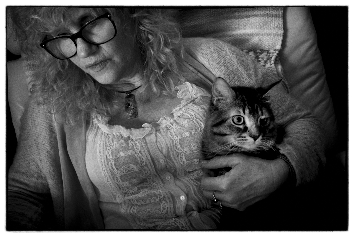
Wally Enjoying some Quality Time with the Wife – From a Fuji S5 Raw File
While I generally dislike almost everything about digital photography, one of the few things I’ve grown to love about it, as a matter of practical adaptation, is its versatility. (My dad would refer to this as “making chicken salad from chicken shit.”) You can start with a RAW file and create any variant of end result you prefer – color, B&W, sepia etc.
An old B&W film guy, I tend to remain one digitally, which means B&W output, which means, at the least, greyscaling RAW files. Unfortunately, simply greyscaling RAW files without more leaves you with what to me look like thin, plasticky photos that scream digital capture. Nothing wrong with that, I guess, if you like that look, but I think digital B&W looks like shit when compared to a good B&W negative wet-printed or scanned. It’s why the Leica MM Monchrom, a great idea in theory, never really interested me. You could argue that it instead of being a throwback to traditional B&W photography, it actually produces files that accentuate the worst aspects of digital B&W.
Enter “film emulation” software, which, surprisingly enough, attempts to take a digitally captured RAW file and create an end result that emulates the look you’d get were it to have been taken with a given film stock. Nik Silver Efex is the best example. Nik (now defunct) extensively researched the looks of various film stocks and produced algorithms that best mimicked the printed result of these films. Unlike what various self-appointed digital experts who give advice about the software seem to think, it isn’t simply a matter of applying an overlay of grain typical of a given film, but rather additionally, and much more importantly, replicating the characteristic exposure curve of a given film.

A Simple Greyscale. No Grain, No Film Exposure Curve Applied
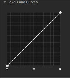
Film meanwhile, doesn’t respond to light in this 1 to 1 fashion; rather, it does so idiosyncratically i.e. in its own individual way.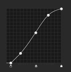
And this is where emulation software runs into problems, because it’s necessarily working with a digital file to begin with, which means that it’s working with a file whose inherent highlights have already been compromised to some extent, and no amount of emulation can recreate highlight information that would be there on a film negative but’s that’s not contained in a digital file.
*************
Tri-X ASA 400
So, we’ve established that film emulation software, while really cool, isn’t completely accurate. At best, it ‘mimics’ the look of film. In any event, I prefer its compromises to the unedited look of grey-scaled digital.
Eureka!
I had spent ages looking at grain, looking at tones, contrast etc., when all I needed to do was look at the relationship between the tones, and I can almost always see a continuum of relations (ooh er missus) between them, nothing is "slightly off"... and it seems to me that the beauty of film is the overall value of the off characteristics of a given emulsion.
---------------------------
In similar vein, I have been reading a book recommended by a commenter on another blog, on the face of it, it doesn't look like a book on photography, but rather book illustration, The book? Picture This - How Pictures Work by Molly Beng.
It seems that this rather amazing (to me) book, has reminded me of Picasso's famous quote: It took me four years to paint like Raphael, but a lifetime to paint like a child. It was clear to me that I have never learned to walk. and there is a reason for that. Nobody has made things simple enough for me. My snaps are many, but the good ones are few.
The reason is that I still photograph like the child, there is no knowingness in the good snaps, they just happen. I don't suppose that anyone makes goo-duns' piecemeal, they have to be worked for, but if the rules have sunk in and you know when and how and why you choose to break them, you are on the road. Incidentally, call me a Philistine, but I have seen much of Picasso's work, and his attempts at painting like a child were frequently very knowing.
There are any number of books available on the subject of photographic composition, and of the ones that I have read, all begin with "the rules". I have read those rules for years, and even remember some of them. Diagonals, thirds, figure to ground.... blah blah blah...
... and then I read that there are creative reasons why one places the main subject away from the middle of the frame, why one would place something at the left side of the frame but complete, or partially outside, why one would move the subject from the bottom to the top... (rule of thirds), also importantly, what the effect of what the photographer or painter is trying to say, and why he might break the rule.
For some, this might come easily or even be latent, but for most it has to be, and can be learned.
There is a significant difference between the painter and the snapper, the snapper is more akin to the sculptor in that his most important task is to eliminate everything from the frame that is not needed (not with editing software either), whereas the painter begins with nothing and adds all that is vital to his vision. It is how JMW Turner contrived to fit several unrelated buildings standing adjacent to each other in his paintings of Venice, and managed to convince his audience of what he had seen. A photographer could never get so lucky.
I realise that the two examples given do not relate particularly, but both are examples of how a particular writer can enthuse and illuminate an idea to some folk, and others to other folk.
Rules are there to be broken.

Comments
Post a Comment